Monday, 14 February 2011

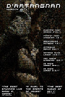
MAGAZINE ADVERT


When creating the Magazine Advert, I had in mind the idea of following the rebellious theme all the way through. As a group, we decided to use the front cover of the CD as out advertising campaign. As it had already been edited for the cover, we simply placed the photo on to a portrait A4 sheet in InDesign. I was assigned to choose fonts and the main layout of the piece; after hours of searching for an appropriate font I found one. I think that it is ‘gritty’ font that represents what the band is about. Even though it may seem like a very particular part of the poster, it is a key element of the design. With most of the poster representing the image and the font, it is important that I correctly reflect our idea. The photo is placed in the far right t convert many stereotypes. To follow our challenging conventions theme, I thought it was an appropriate stimulus for audiences. As well as this the font sizes between the band and the title of the song are different. Again, I think that this converts many advertising campaigns for pop stars in this generation. The font is normally the main article of the poster. It is to imprint in peoples brain; something that grabs their attention and remains with them to pass on to the next person as a means of word-of-mouth. (advertising) with ours however, the smaller font may not grab peoples attention naturally, but if they take time to read the poster, it will imprint in their minds because of the uniqueness. Hopefully, it will be remembered because of the new design layout – separating itself from the millions of advertising campaigns in the media industry today. The use of semiology is where I think the poster excels. Even though, at first glace many will not realise that the poster is challenging conventions the use of semilogy aids to the imprinting of the imagery and in turn the band and their music.

The advert is aimed at ages 15-25, those who stereotypically are known to cause trouble in communities. Targeted at this age group, the magazines that would print the advert would be NME and Q. Magazines that are targeted at similar audiences. As well as this, both magazines include articles about music and clothing; both of which are included in the magazine advert. If it was printed in a magazine, it would successfully root down the brand’s name and image. It would also draw in more ticket sales when advertising the tours dates on the bottom of the advert. Advertising for tours helps prevent illegal downloads and increases profit income. Research shows that the total box-office slaes of the world’s top 50 tours profited $2.93 billion. These included Bon Jovi and Michel Jacksons This Is It Tour on DVD release. Not only do the tickets provide a large profit for artists, but the additional merchandise increases sales.

Tuesday, 8 February 2011

EXPLAIN WHAT THE BRAND OF THE BAND IS THAT YOU ARE TRYING TO PUT ACROSS


The first page of the Digipack is the first element of what the audience will see so we decided to use the DJ as our representation of the band. It has been discussed previously, that although The Bloody Beetroots are a band, we wanted to keep them under the radar with no identity. So, instead we have used the DJ, our main performance narrative as the face for our band. Of course, the front cover must represent the band in a positive, true light. For us, the band was rebellious, edgy and independent, which we tried to portray in the front cover. It is important that the front cover depicts what we intend to show in the video. So in a way we needed a photograph that summed up the video.

The inside left cover reflects our set design. It represents the DJ’s ‘home’ in which he makes money from playing music and lives independently. In a way, our video portrays the idea that without music there is nothing. In terms of our narrative, without the DJ/ The Bloody Beetroots music would not have been present. On another hand, however it could be suggested that he music encourages youths to run riot. Either way, it is for the audience to react personally to the video and produce individual responses. We have included a speech from Marianne Willamson that we thought summed up our video very well. It is almost a synopsis of what our video represents and the attitudes many gangs have towards communities and laws.

The inside right page has been kept very simple. With the majority of this side covered by the disc, we used a plane image of an empty stage with energetic crowds. So, with the CD you can see just the excited crowds, but without the CD the stage is anticipating the act; maybe The Bloody Beetroots. The final page (back cover) shows a finished production. The DJ’s headphones are placed onto of the decks. It shows that the music and rebellion is over for another night. Again, with audiences’ reactions it can be suggested that the rebellion has not stopped, but it may have carried on in another area.

The DigiPack was designed Photoshop. By using the photographs that we took on the day, we collected them all and decided which three to use. We edited slightly on the same program and added them to the page layout. With the inside right age, we searched in the internet from a crowd and stage. We saturated it to black and white and placed it in. It was an all round easy job, but as a group it was harder to decide, aesthetically if we were all satisfied with the cover. I think we tried to reflect the denotation of the general stereotype of youth and rebellion. With the use of colours, shapes and the general design, I think we used semiology appropriately. The use of edited photographs I think gave across the idea of cultural meaning. The idea that youths are superior in our society and will draw attention to themselves any way they can to cause a bigger effect on the rest of the community.

TASK ONE - IN WHAT WAYS DO YOUR MEDIA PRODUCTIONS USE, DEVELOP OR CHALLENGE FORMS AND CONVENTIONS OF REAL MEDIA PRODUCTS?


To begin the process of our pop video, we researched in other, well known pop videos that some what reflected our idea or had an element of what we were looking for. Our immediate react ion was to search YouTube for the videos. With previous experience of pop videos and music we all had a vague idea of other videos that could help us in he development. We ended up at ‘Stress’ by ‘Justice’. It was an extended video which used handheld cameras in a documentary like style. The narrative portrayed a large gang of stereotypical teenagers who were shouting, running and ruining the council estate that they were in. Personally, I felt intimidated by the gang, knowing that it was all acted and staged. But I knew from watching it, that I wanted to achieve the same response for my audience. I wanted it to be a real insight to the behaviour of gangs and for some of the audience members to be frightened and intimated like I was! From here, we knew our convention was to subvert all ideas of polished, aesthetically pleasing videos as well as following the idea of gangs and their antics. We knew that we wanted to imitate the pop videos to give plaisir, the expected pleasure to the audience as Barthes explains, and also subverted the conventions in order to give jouissance, something new or unexpected in Barthes terms.

To be able to follow and subvert these conventions we had to understand and to a certain extent learn them to be able to use them within the narrative. Negus explains them…
  • The explicit and unashamed promotion of the artist’s “image” as a specific product with a brand identity, ready for mass consumption.
  • The featuring of the artist
  • A wide and extensive use of shot types, camera angles and movement.
    Repetition of reoccurring thematic elements and generically specific iconography.

  • A possible narrative structure.
  • A possible performance element
  • The flexibility to disregard realism!
  • Shots cut tightly to the beat of the track
  • Use of special effects
  • A carefully constructed Mise en Scene appropriate to the content and tone of the track
  • High impact instantly
With no lyrics, the song has a personal, individual message that the audiences can make independently. For us, we attempted to represent it as a liberation of freedom for every one in society; freedom of speech. To a certain extent it does strongly follow the stereotype of gang members and their attitudes to society, the idea that all aim to cause mayhem. Of course, this is not true of every gang member in our society, but to follow the convention helped us to create a more visually vivid reflection of our young society. We wanted to follow the same message The Bloody Beetroots did in the original piece.

Again, the lack of lyrics and no official appearance of the band in any kind of performance way, means the image was some what distorted. We had no intentions at any point through out the process of including any shots of the band or equivalent, because we wanted to follow the strong theme of ‘mystery’ and the unknown. I think that as audiences what the video, they start to build a perception of the band members and their attitudes; their personalities must reflect the music that they make. So, directly we did not try to give off a straight forward image of the band, but I think it is quite obvious what sort of people they are through the song. Either way, perceptions; wrong and right will be made. It is therefore up to the audience to decide for themselves.

The DJ narrative (below) portrays some on Negus’ conventions; the featuring of the artist, repetition of reoccurring thematic elements and generically specific iconography and shows that it is cut tightly to the beat of the track. The scene almost contradicts the rule of thirds in that the DJ is positioned in the middle- we wanted to convert stereotypes of composition to create a more rebellious attitude; not just in acting but filming as well. The DJ represents that band as an original stimulus. Even though the Bloody Beetroots are a band, we wanted to convey they as a mysterious couple of people
With no identity. So for a replacement, we used the DJ as a means to a visual stimulus. With the main music source it can be suggested that he is part of the band. However, we leave it up to the audience to decided if there are any more members of the group, and if so, who.

Our main scene of the burning car was an ending without a conclusion. It was be shown that the members of the gangs are rebelling against one another in terms of territory, but it is still unclear how the scene will work out. I think, that in this case we challenged conventions by leaving audiences wanting more. To not give a concise ending, yet a cliff hanger. This scene is a perfect example Negus’ convention of ‘high impact instantly.’ With no ending it is immediately up to the audiences to decide for themselves what will happen next; I feel it gives a more personal response. The mise en scene, tracking and rule of thirds were all ignored and subverted in this scene. When using handheld, it is hard to include and remember camera techniques when moving at such a high pace. The filming was more to catch spontaneity; and with the inability to re-film some scene because of the one chance of smashing a fridge, it was key that we shot it correctly to our theme of rebellion. Without any scripted or structured layout, we mainly considered what we could film, instead of how we would film it. This was fortunate for us, as we wanted to create that gritty kind of feel within every shot.

Finally, this last shot of the day was as risky one. Again, with only four flares to use, we had to ensure that we filmed the scene correctly because we had no opportunity to light more flares for a second attempt. In terms of camera movement and technique, again we were not concerned. To produce the gritty feeling that we wanted, we had to forget the conventions of filming and do our own thing. I think this is were we really started to subvert stereotypes, because not only was our idea a little controversial and different, the filming technique was too. The flexibility to disregard realism fits in perfectly with this scene from Negus’ conventions. We did have the opportunity to twist the truth and create what we wanted to do. Obviously there was structure within the production, but we were able to disregard realism.


Our digipack allows audience to understand the brand of the band. It is a way of attracting those targeted audiences. (16-25) I think this is a very accurate representation of the image and could draw in the right people. With post-production we were able to create dark and more edgy photographs than before. In Photoshop we were able to change saturation and clarity to create a ‘younger’ look. Negus could suggest that ‘the explicit and unashamed promotion of the artist’s “image” as a specific product with a brand identity, ready for mass consumption’ would fit into this CD cover. It is a attractive and colourful product that I think would stand out on any shelf and catch the eye of many audiences.